Sub-Total: $0.00
Edit visual interactions
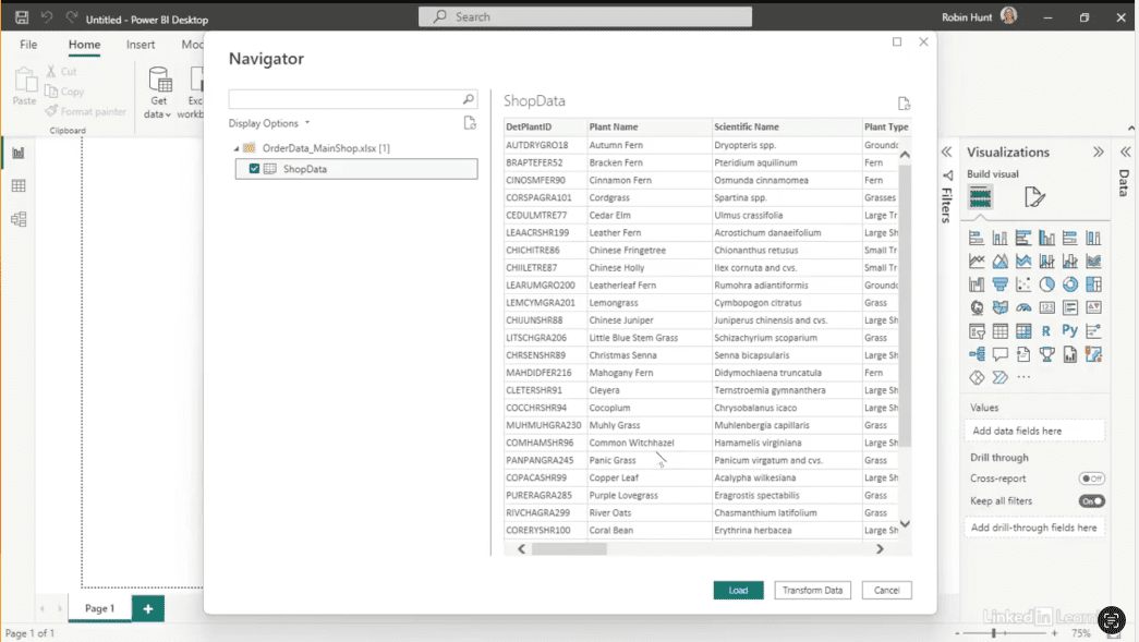
Learn how to make dashboards truly interactive and user-friendly. Dashboards are only valuable if users can explore data without confusion or error. In this Data Survival Skills session, Robin demonstrates how to set up visuals that interact as intended—connecting to shop data, applying page filters, creating slicers, and managing interactions between charts and cards. By structuring interactions properly, you prevent visuals from breaking when filters are applied and allow users to analyze data across multiple perspectives. This method goes beyond basic dashboard building—it ensures every visual responds logically, giving your team clarity, flexibility, and actionable insights without guesswork.
#DataAnalytics #DashboardDesign #PowerBI #DataVisualization #WorkflowOptimization #InteractiveDashboards #BusinessIntelligence #UserExperience #DataInsights


If you’re a data analyst, you’ve no doubt learned different skills, techniques, and tools pertaining to data. But sometimes it can be difficult to know when and why to apply these tools. In this weekly series, instructor Robin Hunt explains a new skill, secret, tip, technique, best practice, or golden piece of advice in each installment. Robin covers topics that can help you do your job better, such as joining data and data designs, privacy for data, transforming and cleaning data, and making data sets and visualizing data.
Note: Because this is an ongoing series, viewers will not receive a certificate of completion.