Sub-Total: $0.00
Analyzing data using a matrix and conditional formats
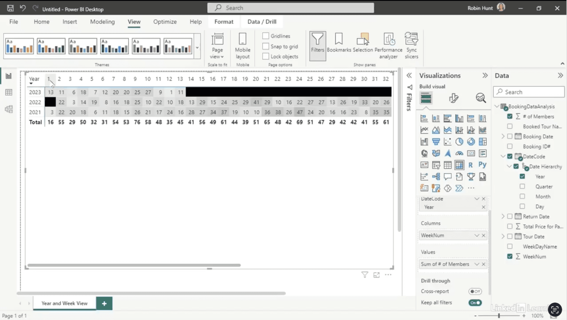
Learn how to uncover hidden booking gaps with Power BI. Static reports often hide the story behind missing activity—weeks or days where tours never filled. In this Data Survival Skills session, Robin shows how to replace Excel pivots with interactive Power BI visuals that make patterns clear. You’ll learn how to build matrices, apply conditional formatting, and drill down from yearly views to daily details for sharper insights. By layering in tour names and dates, you can reveal where demand lags and how marketing efforts change the results. This approach goes beyond simple totals—it connects gaps to strategy, helping you adjust promotions, prove impact, and drive smarter decisions.
#DataAnalytics #PowerBI #DataVisualization #BusinessIntelligence #MarketingInsights #DataSkills #ExploratoryAnalysis #Productivity


If you’re a data analyst, you’ve no doubt learned different skills, techniques, and tools pertaining to data. But sometimes it can be difficult to know when and why to apply these tools. In this weekly series, instructor Robin Hunt explains a new skill, secret, tip, technique, best practice, or golden piece of advice in each installment. Robin covers topics that can help you do your job better, such as joining data and data designs, privacy for data, transforming and cleaning data, and making data sets and visualizing data.
Note: Because this is an ongoing series, viewers will not receive a certificate of completion.