Sub-Total: $0.00
Using Different Pivot Formats to Share Stories
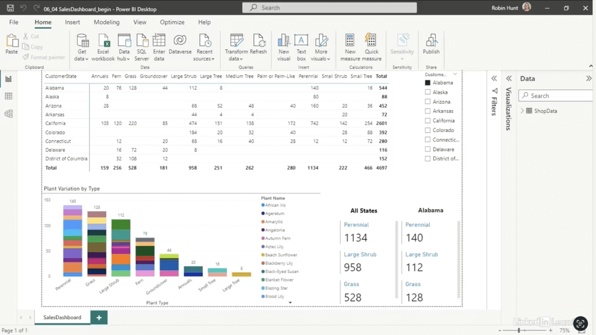
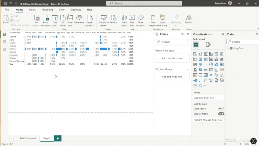
Learn how to enhance storytelling with pivot and matrix visualizations in Power BI. In this Data Survival Skills session, Robin demonstrates how dashboards provide only a surface view, while pivot structures enable deeper exploration of the data model. She walks through techniques for sorting, filtering, applying conditional formatting, and calculating percentages to surface meaningful insights across dimensions such as state, product category, and sales totals. You’ll also see how to leverage hierarchical fields, aggregation logic, and formatting options to reveal hidden trends and highlight key performance drivers. By mastering these techniques, you can transform raw outputs into compelling narratives that support informed, data-driven decision-making.
#DataAnalytics #PowerBI #DataStorytelling #BusinessIntelligence #DataVisualization #ReportDesign #DataModeling #Productivity
If you’re a data analyst, you’ve no doubt learned different skills, techniques, and tools pertaining to data. But sometimes it can be difficult to know when and why to apply these tools. In this weekly series, instructor Robin Hunt explains a new skill, secret, tip, technique, best practice, or golden piece of advice in each installment. Robin covers topics that can help you do your job better, such as joining data and data designs, privacy for data, transforming and cleaning data, and making data sets and visualizing data.
Note: Because this is an ongoing series, viewers will not receive a certificate of completion.