Sub-Total: $0.00
Basic visualization of cohort data
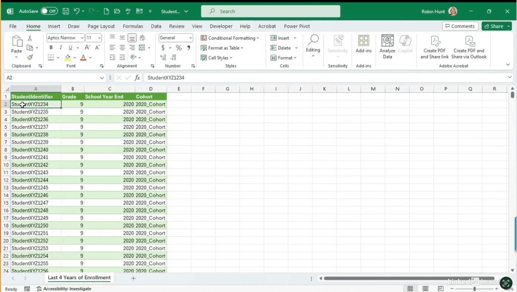
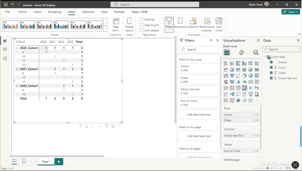
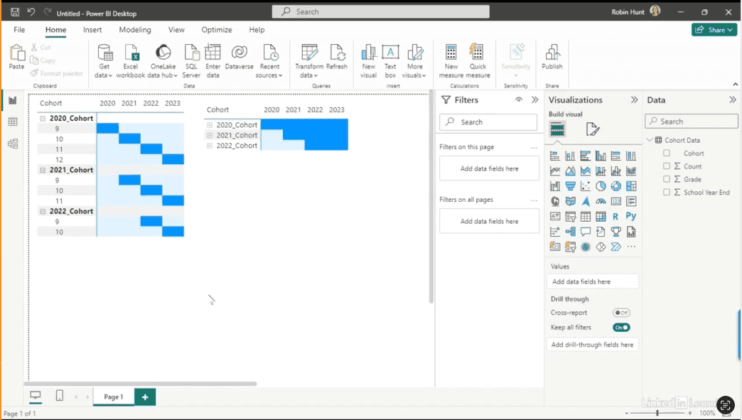
Learn how to clearly visualize cohort data over time. Cohort data can be complex—especially when it comes to tracking progression across grades, years, or other time-based stages. In this Data Survival Skills session, Robin demonstrates how to structure and visualize cohort data in Power BI to make patterns clear and actionable. You’ll see how to build visuals that illustrate natural progressions, highlight when individuals or groups move off track, and make it easier for stakeholders to understand how data flows over time. By using matrix views, formatting techniques, and progression charts, you’ll transform raw numbers into visuals that bring clarity to otherwise confusing datasets. This approach goes beyond reporting—it creates alignment, improves discussions, and ensures that your audience understands the story your data is telling.
#DataAnalytics #CohortAnalysis #PowerBI #DataVisualization #BusinessIntelligence #DataStorytelling #Productivity #EducationData #WorkflowOptimization
If you’re a data analyst, you’ve no doubt learned different skills, techniques, and tools pertaining to data. But sometimes it can be difficult to know when and why to apply these tools. In this weekly series, instructor Robin Hunt explains a new skill, secret, tip, technique, best practice, or golden piece of advice in each installment. Robin covers topics that can help you do your job better, such as joining data and data designs, privacy for data, transforming and cleaning data, and making data sets and visualizing data.
Note: Because this is an ongoing series, viewers will not receive a certificate of completion.