Sub-Total: $0.00
Creating simple data sets with basic visuals for presentations
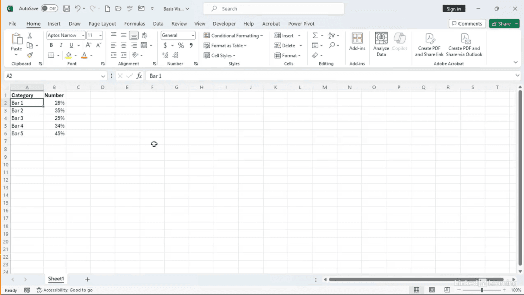
Learn how to create simple, professional visuals from basic datasets. Sharing data isn’t just about the numbers—it’s about presenting them clearly and effectively. In this Data Survival Skills session, Robin demonstrates how to turn small datasets into polished visuals for reports, presentations, and updates. You’ll learn how to build bar and line charts, adjust formatting for readability, customize colors and styles to fit your brand, and save chart templates for easy reuse. By mastering these quick techniques, you’ll save time, maintain consistency, and deliver visuals that make an impact without extra effort. This approach goes beyond default Excel charts—it ensures your data looks professional, stays clear, and supports your message every time.
#DataAnalytics #DataVisualization #ExcelTips #DataSkills #BusinessIntelligence #Productivity #WorkflowOptimization #PresentationDesign #DataStorytelling

If you’re a data analyst, you’ve no doubt learned different skills, techniques, and tools pertaining to data. But sometimes it can be difficult to know when and why to apply these tools. In this weekly series, instructor Robin Hunt explains a new skill, secret, tip, technique, best practice, or golden piece of advice in each installment. Robin covers topics that can help you do your job better, such as joining data and data designs, privacy for data, transforming and cleaning data, and making data sets and visualizing data.
Note: Because this is an ongoing series, viewers will not receive a certificate of completion.