Sub-Total: $0.00
Working with Different Group Sizes
Learn how to compare uneven group sizes with PivotTables and charts in Excel.
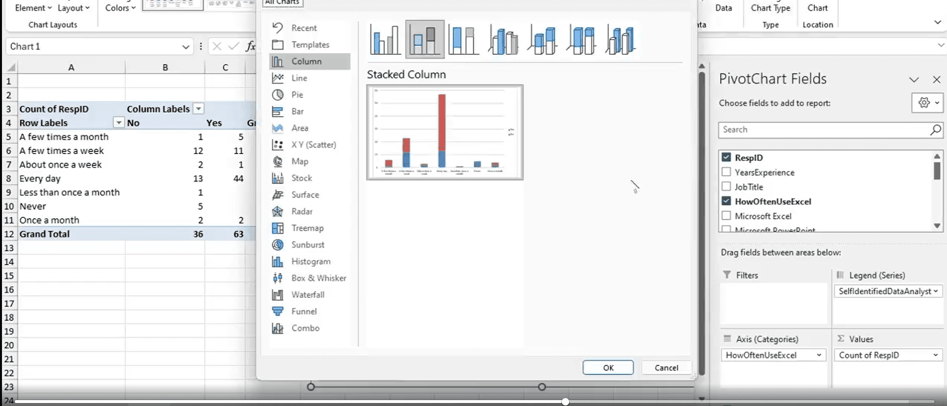
Not all data sets are balanced—sometimes one subgroup is much larger than another. In this Data Survival Skills session, Robin shows how to analyze analysts vs. non-analysts by building PivotTables and transforming the results into 100% stacked charts. By restructuring the data, you’ll see not just how many people fall into each category, but how their behaviors and responses differ across questions. This approach helps you move beyond simple counts and uncover the story hidden in subgroup comparisons—whether that means spotting trends, identifying patterns, or telling a clearer story with your data.
#ExcelTips #DataAnalytics #PivotTables #DataVisualization #BusinessIntelligence #StorytellingWithData #DataSkills #Productivity
If you’re a data analyst, you’ve no doubt learned different skills, techniques, and tools pertaining to data. But sometimes it can be difficult to know when and why to apply these tools. In this weekly series, instructor Robin Hunt explains a new skill, secret, tip, technique, best practice, or golden piece of advice in each installment. Robin covers topics that can help you do your job better, such as joining data and data designs, privacy for data, transforming and cleaning data, and making data sets and visualizing data.
Note: Because this is an ongoing series, viewers will not receive a certificate of completion.